

The SRE Guide to Kubernetes Observability: RED vs. USE Methods


Mesut Oezdil
July 2, 2026
If you build dashboards for Kubernetes services, you have probably heard of RED and USE. Both terms are often taught as if they were two views of the same thing, but they’re not. Each method answers a different question, applies to a different layer of the stack, and is blind to exactly what the other sees. This blog post draws that line clearly, shows how a service mesh hands you RED for free the moment you inject a proxy, and walks through a real incident where you need both methods open at the same time to understand what is happening.
What is the RED method?
Tom Wilkie introduced the RED method for instrumenting request-serving services in 2015, while building tooling for container-based systems. He first showed it at a Prometheus meetup in London. The idea came out of his earlier years as an SRE at Google, where he relied on the Four Golden Signals. RED keeps three of those four signals (saturation was dropped) so that every service can be uniformly instrumented and on-call engineers can cover services they never wrote themselves.
All three are request-level signals that share a single scope, and each one tells you about a different kind of problem:
- Rate: requests per second the service receives
- Errors: the fraction of those requests that fail
- Duration: how long requests take, expressed as percentiles (p50, p95, p99).
RED is scoped to services and to the perspective of whoever is calling them. It tells you whether a service is doing its job as its callers see it, which in a service mesh is typically another service rather than the end user.
What is the USE method?
Brendan Gregg’s USE method applies to resources: CPU, memory, disk, network queues, and any other device that can be exhausted. CPU, memory, disk, network queues, and any other device that can be exhausted. He defined it in 2012 while working on low-level systems and kernel performance work. The goal was to turn bottleneck hunting into a fixed checklist. Instead of guessing which part of a machine is slow, you just asked three questions:
- Utilization: What fraction of capacity is in use?
- Saturation: How much work is queued waiting for the resource?
- Errors: What device-level faults are occurring?
That resource framing is why USE talks in terms of devices and capacity. It tells you whether a resource is healthy. The question it answers stops at the resource boundary: CPU, memory, disk, and queue depth. Whether the services running on that resource are serving callers correctly is a different question entirely.
Why they aren’t the same question
The confusion between RED and USE is unsurprising. Let's say your team wants a service health dashboard. You pull node CPU, memory, and network utilization into Grafana, wire up alerts, and call it done. Alerts will fire when the node is stressed.
At 2 am, a customer reports slowness. The on-call engineer opens the node dashboard and sees that CPU is at 43% and memory looks good. There are no alerts, so the on-call engineer goes back to sleep.
What the node dashboard missed is that the frontend pod’s CPU limit was set too tight for its traffic volume. The pod was being throttled at 100% of its cgroup quota while the node as a whole sat under-utilized. Pod-level CPU throttling doesn’t show up in node-level utilization. Those are different measurements of different things. At the same time, p99 latency on frontend had climbed from 196 ms to 288 ms, and throughput had dropped by a third. Success rate was still 100%, so the availability alert stayed quiet. A RED dashboard on frontend would have surfaced the latency rise on the first scrape interval. The node USE dashboard showed nothing wrong because, at the node level, nothing was wrong.
The reverse direction is equally blind. A cpu-hog pod running stress --cpu 4 against its cgroup limit shows a CPU throttle ratio approaching 1.0 in the cAdvisor metrics. It serves no requests. A RED dashboard for that pod would have no data at all, because there is no traffic to measure. USE is the only lens that sees resource exhaustion in a workload that doesn’t serve requests.
A distinction worth pointing out is that RED errors are failed requests and USE errors are device faults, so even though they share the letter E, they measure different things at different layers.
Here's how you should use these metrics: If you’re paged because something is slow or failing, open RED first. RED tells you which service is hurting and how badly. Then open USE to find out why. If you start with USE, you risk spending 20 minutes confirming that the node looks fine while your users are staring at a 400 ms p99.
Linkerd metrics give you RED for free
A frequent objection to RED is instrumentation cost. Every service needs a metrics library, a /metrics endpoint, and someone to maintain both through refactors and rewrites. In a service mesh, that cost goes to zero for east-west traffic the moment a workload is meshed.
Linkerd’s data plane proxy sits in the request path of every meshed pod. Without any change to application code, the proxy emits two metric families per pod, as documented in the Linkerd proxy metrics reference:
response_total: a counter labeled by status_code, classification (success or failure), direction, caller identity, and portresponse_latency_ms_bucket: a histogram of request durations
Those two families together are Rate, Errors, and Duration, the full RED coverage with zero instrumentation. Here is what the proxy actually exposes at /metrics on port 4191, pulled from frontend on the live cluster (labels abbreviated for readability):
No application instrumentation was needed. The proxy generated them based on observed traffic. The classification label is what the Errors query filters on; status_code is there if you need per-code breakdowns. The ratio response_latency_ms_sum / response_latency_ms_count gives you the mean, and the bucket series (one line per le boundary) is what histogram_quantile(0.99, ...) consumes for p99.
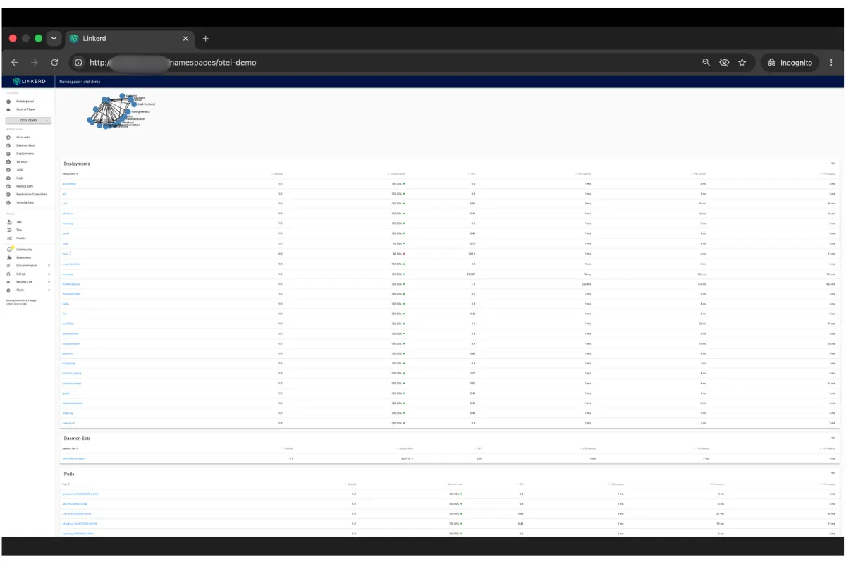
When running the OpenTelemetry Demo on K3s v1.34.6 with Linkerd edge-26.6.3, all 22 services were meshed by annotating the namespace with no application changes. frontend reported immediately:
Linkerd Viz gives you this without writing a single PromQL query. The namespace overview lists every meshed service’s success rate, RPS, and p50/p95/p99 latency as soon as the proxy is running.
.webp)
The per-edge view is where the zero-instrumentation argument becomes more compelling. When frontend shows 99.97% overall success rate, Linkerd Viz already knows which downstream dependency is dragging that number down per edge, at what rate and with what latency. In a 22-service system that covers hundreds of service-to-service edges, all instrumented automatically. Finding the degraded edge in a hand-instrumented system requires per-client metrics in every service. The mesh gives it to you with one click.
To query these metrics in your own Prometheus instead of Viz’s bundled instance, deploy a PodMonitor that targets the proxy’s linkerd-admin port at 4191:
apiVersion: monitoring.coreos.com/v1
kind: PodMonitor
metadata:
  name: linkerd-proxy
  namespace: monitoring
  labels:
    release: kps
spec:
  namespaceSelector:
    any: true
  selector: {}
  podMetricsEndpoints:
  - port: linkerd-admin
    path: /metrics
    interval: 10s
    relabelings:
    - sourceLabels: [__meta_kubernetes_namespace]
      targetLabel: namespace
    - sourceLabels: [__meta_kubernetes_pod_name]
      targetLabel: pod
    - sourceLabels:
[__meta_kubernetes_pod_label_linkerd_io_proxy_deployment]
      targetLabel: deployment
Two things that broke my RED queries before I got this right. The first was a missing label. The proxy doesn’t emit a deployment label on its own. Linkerd Viz’s bundled Prometheus adds it internally using its own relabeling rules, and those rules don’t exist when you bring your own scraper. Without the third relabeling entry above, every query grouped by deployment returns nothing. The series are correctly scraped, but missing the label your PromQL expects. The solution is the linkerd_io_proxy_deployment pod annotation, which the injector sets automatically on every meshed pod, mapped to a deployment target label in the PodMonitor.
The second was the scrape itself inflating the numbers. Port 4191 is an HTTP service, so every scrape probe that hits it appears in response_total as a real entry with srv_port="4191". For frontend, that came to 0.18 req/s of background noise sitting next to 0.54 req/s of real traffic, a 25% inflation in the Rate panel. Even worse, health check probes that time out show up as failures and pollute your Errors panel with phantom faults. Linkerd Viz handles this internally and never shows it to you, something that bring-your-own Prometheus does not. Every RED query in this dashboard adds srv_port!="4191" to exclude it.
The 3 queries below are what the combined dashboard uses for its RED row, validated against the live cluster. Substitute your own namespace and deployment:
One boundary is that mesh-derived RED covers east-west traffic between meshed pods. Workloads that aren’t yet meshed, and north-south traffic entering through an ingress, need a separate instrumentation source. The proxy only sees what passes through it.
USE fills the other half
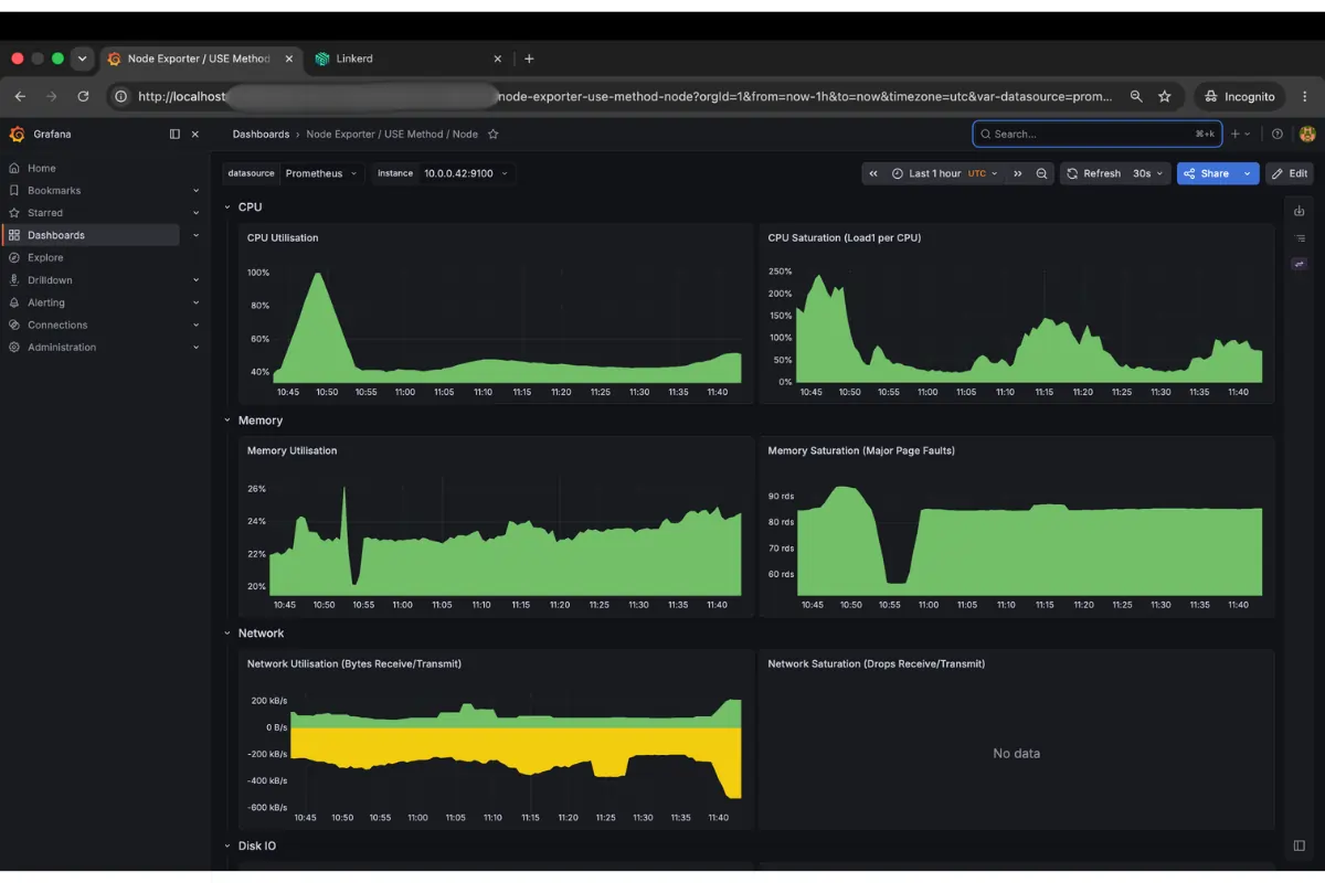
While the proxy sees requests, node and pod resource pressure come from node-exporter for host-level signals and from kube-state-metrics plus cAdvisor (via the kubelet) for container-level signals.
In Kubernetes, the container-level cgroup signals are often more informative than node-level averages. A node sitting at 50% aggregate CPU utilization can have individual pods throttled to 100% of their cgroup limits simultaneously. The throttle ratio makes this visible:
A ratio approaching 1.0 means the pod is CPU-saturated at its cgroup ceiling, regardless of what the node-level utilization shows. This is what the 2 am example mentioned above was about. USE Saturation at the pod layer is invisible to node-level USE.
USE Errors at the container level most often surface as OOMKills. A pod that exceeds its memory limit doesn’t return an error to its callers. It terminates immediately with exit code 137 and restarts. The signal is in kube-state-metrics:
A RED dashboard for that pod catches only a brief spike in errors at the restart moment, easy to miss in normal noise. But USE sees the underlying pattern: repeated restarts with a consistent cause at a predictable interval. That’s a memory limit set too low and not a transient failure. In our lab, a mem-hog container limited to 128 Mi was restarted 3 times in the measurement window, each time with exit 137. Its RED metrics were clean between restarts while its USE signal kept firing.
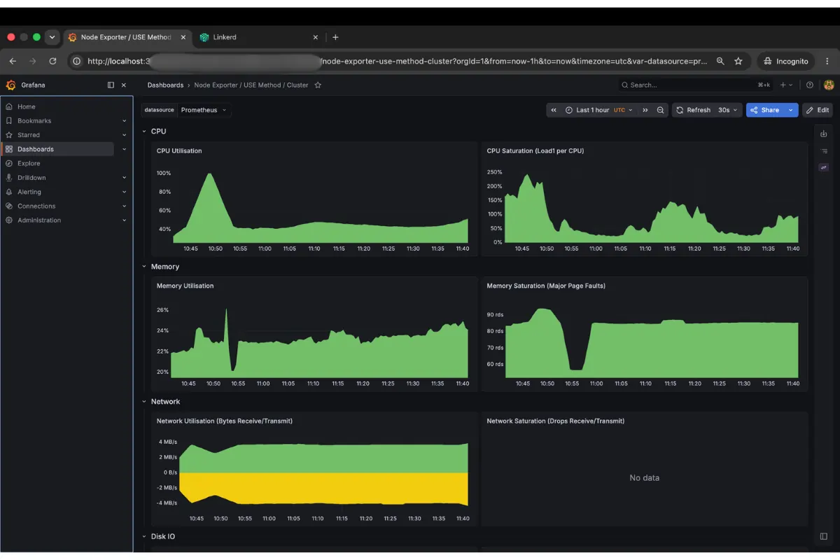
The node dashboard shows CPU at 43-50% and memory under 25%, the kind of baseline that stays green on-call while a single pod’s cgroup thrashes above its limit. The cluster rollup tells the same story at aggregate level. Nothing is alarming, no reason to page someone.
A worked example: RED and USE on one dashboard
The combined dashboard (red-use.json, importable into any Grafana instance backed by Prometheus) puts both methods on one screen: mesh-derived RED on top and node and pod USE on the bottom, templated by $namespace and $deployment.
With steady load on frontend from a meshed slow_cooker instance, we saturated the node CPU by deploying a stress --cpu 8 pod without a resource limit, then removed it.
The success rate stayed at 100% the entire time, so an error-rate alert wouldn’t have fired. The signal RED was carrying was Duration: p99 climbed 47% while the node was pinned.
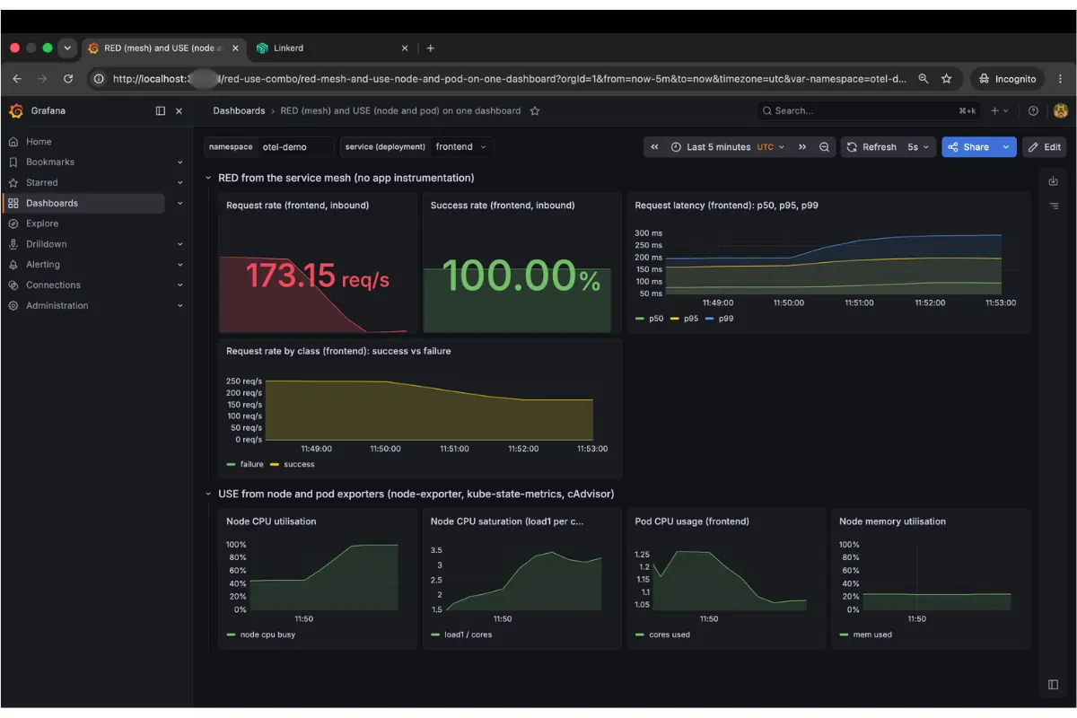
Read the screenshot from top to bottom. At the top left you see the request rate at 173 req/s, down from 255. The CPU contention is slowing the service. At the top center, the success rate is locked at 100% and green the whole time. That green is misleading. If your only alert is on error rate, you are silent while users wait. The latency panel tells you what's going on. p50 is flat, but p95 and p99 peel upward on the right edge of the graph, exactly as the saturation begins. Now look at the bottom row. Node CPU climbs to 100% at the same minute. The cause is directly below the effect on the same time axis. That alignment is what makes this dashboard useful.
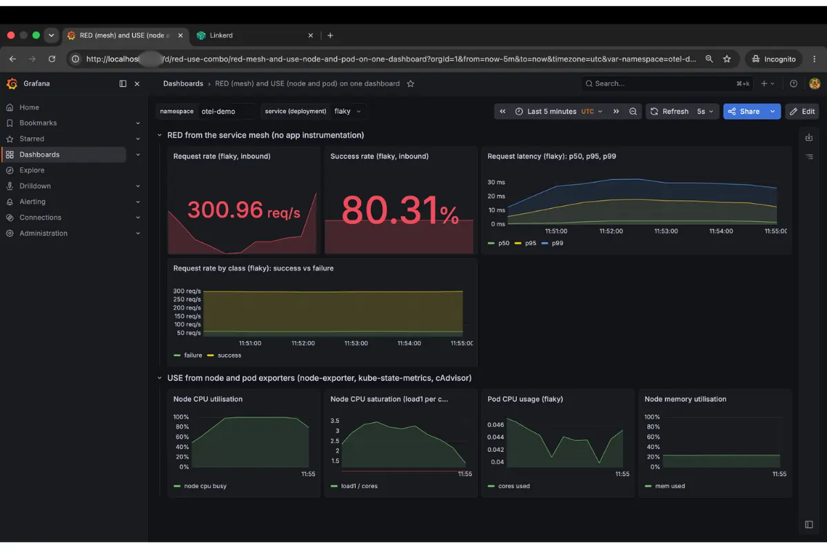
The Errors dimension of RED is the clearest indicator when the problem is in the application, not the infrastructure. A go-httpbin instance configured to return HTTP 500 on 20% of requests showed 300 req/s and 80.31% success rate in the mesh metrics. The USE panels stayed flat. A workload running at 0.025 cores on a node at 47% CPU has nothing to report at the resource layer. The failure lived in application logic, so USE would never surface it.
Where each earns its place
If you’re already running a service mesh, you have RED for every meshed workload. The exporters give you USE for the layer the mesh can’t see. Wire both into the same dashboard, and the next 2 am page answers itself.
Sources
- Tom Wilkie, the RED method: grafana.com/blog/2018/08/02/the-red-method-how-to-instrument-your-services
- Brendan Gregg, the USE method: brendangregg.com/usemethod.html
- Linkerd proxy metrics reference: linkerd.io/2.19/reference/proxy-metrics
- Prometheus node-exporter: github.com/prometheus/node_exporter
- kube-state-metrics: github.com/kubernetes/kube-state-metrics
About the Author
Mesut is a DevOps engineer and a cloud native open source contributor (Project HAMi, kagent, et al.) based in Stuttgart, Germany. You can find his work on GitHub and connect with him on LinkedIn.
FAQ
What's the difference between the RED method and the USE method?
RED tracks rate, errors, and duration for services, from the caller's point of view. USE tracks utilization, saturation, and errors for resources like CPU, memory, and disk. They cover different layers, and each is blind to what the other sees.
What is the RED method for Kubernetes monitoring?
Tom Wilkie introduced RED in 2015 to instrument request-serving services. It tracks rate (requests per second), errors (percentage that fail), and duration (latency percentiles like p50, p95, p99) as callers experience them.
What is the USE method for Kubernetes monitoring?
Brendan Gregg defined USE in 2012 for resources like CPU, memory, disk, and network queues. It asks how much capacity is used (utilization), how much work is queued (saturation), and what faults occur (errors).
How does Linkerd give you RED metrics without instrumenting your application code?
Linkerd's proxy sits in every meshed pod's request path and emits response_total and response_latency_ms_bucket metrics automatically. Together they cover rate, errors, and duration for east-west traffic, with zero code changes.
Can a service pass its RED checks while still having a resource problem?
Yes. In our incident, frontend's success rate stayed at 100% while its pod was throttled to its CPU limit. RED showed rising p99 latency, but only USE metrics like CPU throttle ratio revealed the cause.


